Is this what political will looks like?

Smoke on the freeway by TonyGman

To quote the photographer:

This is the Perris, Ca, 215 northbound south of perris blvd during the morning commute. This would normally be a bright time of the day, but this morning, traffic was a little stop and go due to the smoke from the local fires here in southern california.

A little understated, perhaps?

As awful as all this was, I have to wonder if this is what it will take to get people to take climate change seriously. Unfortunately even people who realize that we have a major problem on our hands are often overwhelmed by the thing, and tend to add it to the long list of Bad Things That Mostly Affect Someone Else (AIDS in Africa, the Israeli/Palestinian conflict, even Shrub’s fiasco in Iraq) and change the channel.

This is particularly sad because climate change is one of those things that Americans can do something about quite directly. It’s pretty hard for me to make a major difference in a lot of situations (although that’s no excuse for not trying), but climate change is all about my behavior. I can drive less (or not at all). I can replace incandescent bulbs with CFs and turn them off when I leave the room. I can turn down the thermostat. I can support alternative energy programs. I can purchase carbon offsets. I can avoid buying produce that flew half way around the world. I can reduce, reuse, recycle. And if even some of the rest of you do the same, we make a significant difference. We probably won’t solve the problem by ourselves, but we can start the ball rolling, proving that there is support for change at the consumer (and voter) level.

It’s arguably one of the best examples of where “Think Globally, Act Locally” can really make a profound difference.

Unfortunately important things like not driving and skipping the raspberries flown in from remote lands comes at a personal inconvenience. This requires will which, sadly, is typically driven by fear. So maybe we need a few scares like this (along with tragedies like Katrina) to generate the kind of immediacy and fear necessary to get us out of our single-occupant SUVs.

Best hope we turn things around before the tragedy comes to your home, though.

Thanks to TonyGman for the great photo.
Related posts

The power of good visualization

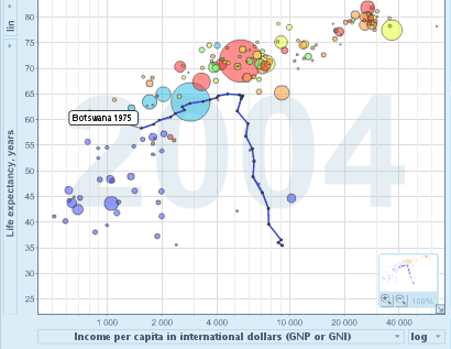
Drop in life expectancy in Botswana visualized with Gapminder

I just discovered The Gapminder, a very cool visualization tool created by Hans Rosling and others. It gives you the ability to visualize changes in a variety of socio-economic indicators across both space and time, with particularly effective use of simple animations across the time dimension.

It’s really cool to play with, and there are a lot of things you can change that aren’t immediately obvious (I found the short demo in the on-line help quite helpful). You can certainly learn a lot by goofing around with it (as well as generate a lot of meaningless visual noise). The screenshot above is from a plot of life expectancy vs. per capita income over time (the default plot you get when you start it up). I had to watch it a few times to sift out some trends, but after getting past the obvious “generally, more money means longer life” I realized that lots of blue bubbles (i.e., African countries) were “falling” out of the cloud at the end like particulates settling out of a liquid. This indicates that their life expectancy has plummeted in the last few years, which is obviously not the right direction. Why? Almost certainly the continuing AIDS crisis in large parts of Africa, and visualizations like this make it painfully (literally) obvious that this must be cause for serious concern.

In the graph above, I’ve highlighted Botswana,which shows a particularly depressing case. Both their life expectancy and per capita incomes were moving in a happy direction until the early 90’s when, despite continued gains in per capita income (which I’d like to know more about), their life expectancy flew the wrong direction.

Take a second to think about the enormous human suffering a change like that implies.

Thanks to John Hawks for the pointer. Hawks points out that the use of circles of different areas probably isn’t a great way to visualize quantitative differences (a general point Tufte raised years ago), but Rosling’s going for quick impact rather than quantitative precision:

So far, we have had a major hit with two target groups: children under 12 and heads of state. What they have in common is that you have only 5 to 10 seconds to impress them.

(You just have to love the reality that you need the same tools to communicate with little kids and world leaders. Maybe we should just put the little kids in charge? They might have more empathy.)

One thing that really annoyed me when I wrote this post was the fact that you can’t easily embed these graphs in a web page. I don’t think I’d really appreciated how used I’d grown to being able to embed images, video, maps, slideshows, and the like in blog posts. I think embedding has become absolutely key to the success and mass propagation on the web, and people designing new tools (or updating existing ones) better keep that in mind.

Related posts